suppressPackageStartupMessages({
library("msqrob2")
library("data.table")
library("dplyr")
library("tidyr")
library("ggplot2")
library("patchwork")
library("tidyverse")
})5 Data analysis workflow optimisation (DDA)
In the previous chapter we have seen how to benchmark the data analysis performance when starting from different types of data. This chapter presents how to assess the impact of different methods for the same sequence of steps on the same data, effectively optimising the workflow.
To illustrate the approach, we will again use the data set by (Shen et al. 2018), a spike-in data set with known ground truth. The optimisation focuses on two steps: we will explore different methods for normalisation and summarisation.
Important: the first sections of the chapter are again meant for advanced users that are familiar with R scripting. Novice users interested in the key messages and best practices can refer to the take home message section.
5.1 Load packages
We load the msqrob2 package, along with additional packages for data manipulation and visualisation.
We also configure the parallelisation framework.
library("BiocParallel")
register(SerialParam())
5.2 Data
We will reuse the data by (Shen et al. 2018) as in Chapter 1 and Chapter 4. The data were reanalysed using MaxQuant, and we will use start from the evidence file as suggested in the previous chapter.
5.2.1 PSM table
We here retrieve the evidence file containig the PSM table.
library("BiocFileCache")Loading required package: dbplyr
Attaching package: 'dbplyr'The following objects are masked from 'package:dplyr':
ident, sqlbfc <- BiocFileCache()
evidenceFile <- bfcrpath(bfc, "https://github.com/statOmics/msqrob2data/raw/refs/heads/main/dda/shen/evidence.zip")We again generate the annotation table from the raw file names.
The data consists of a spike-in experiment with E. coli lysates spiked at five different concentrations (3%, 4.5%, 6%, 7.5% and 9% wt/wt) in a trypsin-digested human background.
concentrations <- (2:6) * 1.5
names(concentrations) <- LETTERS[1:5]
concentrations
A B C D E
3.0 4.5 6.0 7.5 9.0 Load the evidence table.
evidence <- fread(evidenceFile, check.names = TRUE, integer64 = "double")The evidence file is a long table. Information on the raw files is stored in column Raw.file
rawfiles <- unique(evidence$Raw.file)
rawfiles
[1] "B03_03_150304_human_ecoli_C_3ul_3um_column_95_HCD_OT_2hrs_30B_9B"
[2] "B03_08_150304_human_ecoli_C_3ul_3um_column_95_HCD_OT_2hrs_30B_9B"
[3] "B03_18_150304_human_ecoli_C_3ul_3um_column_95_HCD_OT_2hrs_30B_9B"
[4] "B03_19_150304_human_ecoli_B_3ul_3um_column_95_HCD_OT_2hrs_30B_9B"
[5] "B03_07_150304_human_ecoli_D_3ul_3um_column_95_HCD_OT_2hrs_30B_9B"
[6] "B03_14_150304_human_ecoli_D_3ul_3um_column_95_HCD_OT_2hrs_30B_9B"
[7] "B03_15_150304_human_ecoli_E_3ul_3um_column_95_HCD_OT_2hrs_30B_9B"
[8] "B03_21_150304_human_ecoli_A_3ul_3um_column_95_HCD_OT_2hrs_30B_9B"
[9] "B03_05_150304_human_ecoli_E_3ul_3um_column_95_HCD_OT_2hrs_30B_9B"
[10] "B03_09_150304_human_ecoli_B_3ul_3um_column_95_HCD_OT_2hrs_30B_9B"
[11] "B03_10_150304_human_ecoli_A_3ul_3um_column_95_HCD_OT_2hrs_30B_9B"
[12] "B03_11_150304_human_ecoli_A_3ul_3um_column_95_HCD_OT_2hrs_30B_9B"
[13] "B03_12_150304_human_ecoli_B_3ul_3um_column_95_HCD_OT_2hrs_30B_9B"
[14] "B03_13_150304_human_ecoli_C_3ul_3um_column_95_HCD_OT_2hrs_30B_9B"
[15] "B03_16_150304_human_ecoli_E_3ul_3um_column_95_HCD_OT_2hrs_30B_9B"
[16] "B03_17_150304_human_ecoli_D_3ul_3um_column_95_HCD_OT_2hrs_30B_9B"
[17] "B03_20_150304_human_ecoli_A_3ul_3um_column_95_HCD_OT_2hrs_30B_9B"
[18] "B03_02_150304_human_ecoli_B_3ul_3um_column_95_HCD_OT_2hrs_30B_9B"
[19] "B03_04_150304_human_ecoli_D_3ul_3um_column_95_HCD_OT_2hrs_30B_9B"
[20] "B03_06_150304_human_ecoli_E_3ul_3um_column_95_HCD_OT_2hrs_30B_9B"With QFeatures we can read data in long tables, but the annotation file than needs to have a column named runCol. Information on the spikein condition is indicated with a letter, A - E, which is on position 27 in the file name. The acquisition was don in an end-over-end and alternating manner: A1, B1, C1, D1, E1, E2, D2, C2, B2, A2, … This can be seen if we sort the raw files alphabetically. Positions 5 and 6 in the file name seem to indicate the acquisition order.
(
  rawfiles <- sort(rawfiles)
)
[1] "B03_02_150304_human_ecoli_B_3ul_3um_column_95_HCD_OT_2hrs_30B_9B"
[2] "B03_03_150304_human_ecoli_C_3ul_3um_column_95_HCD_OT_2hrs_30B_9B"
[3] "B03_04_150304_human_ecoli_D_3ul_3um_column_95_HCD_OT_2hrs_30B_9B"
[4] "B03_05_150304_human_ecoli_E_3ul_3um_column_95_HCD_OT_2hrs_30B_9B"
[5] "B03_06_150304_human_ecoli_E_3ul_3um_column_95_HCD_OT_2hrs_30B_9B"
[6] "B03_07_150304_human_ecoli_D_3ul_3um_column_95_HCD_OT_2hrs_30B_9B"
[7] "B03_08_150304_human_ecoli_C_3ul_3um_column_95_HCD_OT_2hrs_30B_9B"
[8] "B03_09_150304_human_ecoli_B_3ul_3um_column_95_HCD_OT_2hrs_30B_9B"
[9] "B03_10_150304_human_ecoli_A_3ul_3um_column_95_HCD_OT_2hrs_30B_9B"
[10] "B03_11_150304_human_ecoli_A_3ul_3um_column_95_HCD_OT_2hrs_30B_9B"
[11] "B03_12_150304_human_ecoli_B_3ul_3um_column_95_HCD_OT_2hrs_30B_9B"
[12] "B03_13_150304_human_ecoli_C_3ul_3um_column_95_HCD_OT_2hrs_30B_9B"
[13] "B03_14_150304_human_ecoli_D_3ul_3um_column_95_HCD_OT_2hrs_30B_9B"
[14] "B03_15_150304_human_ecoli_E_3ul_3um_column_95_HCD_OT_2hrs_30B_9B"
[15] "B03_16_150304_human_ecoli_E_3ul_3um_column_95_HCD_OT_2hrs_30B_9B"
[16] "B03_17_150304_human_ecoli_D_3ul_3um_column_95_HCD_OT_2hrs_30B_9B"
[17] "B03_18_150304_human_ecoli_C_3ul_3um_column_95_HCD_OT_2hrs_30B_9B"
[18] "B03_19_150304_human_ecoli_B_3ul_3um_column_95_HCD_OT_2hrs_30B_9B"
[19] "B03_20_150304_human_ecoli_A_3ul_3um_column_95_HCD_OT_2hrs_30B_9B"
[20] "B03_21_150304_human_ecoli_A_3ul_3um_column_95_HCD_OT_2hrs_30B_9B"Apparently sample A1 has been rerun.
(
  rawfiles <- rawfiles[c(20,1:19)]
)
[1] "B03_21_150304_human_ecoli_A_3ul_3um_column_95_HCD_OT_2hrs_30B_9B"
[2] "B03_02_150304_human_ecoli_B_3ul_3um_column_95_HCD_OT_2hrs_30B_9B"
[3] "B03_03_150304_human_ecoli_C_3ul_3um_column_95_HCD_OT_2hrs_30B_9B"
[4] "B03_04_150304_human_ecoli_D_3ul_3um_column_95_HCD_OT_2hrs_30B_9B"
[5] "B03_05_150304_human_ecoli_E_3ul_3um_column_95_HCD_OT_2hrs_30B_9B"
[6] "B03_06_150304_human_ecoli_E_3ul_3um_column_95_HCD_OT_2hrs_30B_9B"
[7] "B03_07_150304_human_ecoli_D_3ul_3um_column_95_HCD_OT_2hrs_30B_9B"
[8] "B03_08_150304_human_ecoli_C_3ul_3um_column_95_HCD_OT_2hrs_30B_9B"
[9] "B03_09_150304_human_ecoli_B_3ul_3um_column_95_HCD_OT_2hrs_30B_9B"
[10] "B03_10_150304_human_ecoli_A_3ul_3um_column_95_HCD_OT_2hrs_30B_9B"
[11] "B03_11_150304_human_ecoli_A_3ul_3um_column_95_HCD_OT_2hrs_30B_9B"
[12] "B03_12_150304_human_ecoli_B_3ul_3um_column_95_HCD_OT_2hrs_30B_9B"
[13] "B03_13_150304_human_ecoli_C_3ul_3um_column_95_HCD_OT_2hrs_30B_9B"
[14] "B03_14_150304_human_ecoli_D_3ul_3um_column_95_HCD_OT_2hrs_30B_9B"
[15] "B03_15_150304_human_ecoli_E_3ul_3um_column_95_HCD_OT_2hrs_30B_9B"
[16] "B03_16_150304_human_ecoli_E_3ul_3um_column_95_HCD_OT_2hrs_30B_9B"
[17] "B03_17_150304_human_ecoli_D_3ul_3um_column_95_HCD_OT_2hrs_30B_9B"
[18] "B03_18_150304_human_ecoli_C_3ul_3um_column_95_HCD_OT_2hrs_30B_9B"
[19] "B03_19_150304_human_ecoli_B_3ul_3um_column_95_HCD_OT_2hrs_30B_9B"
[20] "B03_20_150304_human_ecoli_A_3ul_3um_column_95_HCD_OT_2hrs_30B_9B"(
coldata <- data.frame(runCol = rawfiles) |>
mutate(Condition = substr(runCol,27,27),
Concentration = concentrations[Condition],
Sample = paste0(
rep(letters[c(1:5,5:1)],2),
rep(1:4, each = 5))
)
) runCol Condition
1 B03_21_150304_human_ecoli_A_3ul_3um_column_95_HCD_OT_2hrs_30B_9B A
2 B03_02_150304_human_ecoli_B_3ul_3um_column_95_HCD_OT_2hrs_30B_9B B
3 B03_03_150304_human_ecoli_C_3ul_3um_column_95_HCD_OT_2hrs_30B_9B C
4 B03_04_150304_human_ecoli_D_3ul_3um_column_95_HCD_OT_2hrs_30B_9B D
5 B03_05_150304_human_ecoli_E_3ul_3um_column_95_HCD_OT_2hrs_30B_9B E
6 B03_06_150304_human_ecoli_E_3ul_3um_column_95_HCD_OT_2hrs_30B_9B E
7 B03_07_150304_human_ecoli_D_3ul_3um_column_95_HCD_OT_2hrs_30B_9B D
8 B03_08_150304_human_ecoli_C_3ul_3um_column_95_HCD_OT_2hrs_30B_9B C
9 B03_09_150304_human_ecoli_B_3ul_3um_column_95_HCD_OT_2hrs_30B_9B B
10 B03_10_150304_human_ecoli_A_3ul_3um_column_95_HCD_OT_2hrs_30B_9B A
11 B03_11_150304_human_ecoli_A_3ul_3um_column_95_HCD_OT_2hrs_30B_9B A
12 B03_12_150304_human_ecoli_B_3ul_3um_column_95_HCD_OT_2hrs_30B_9B B
13 B03_13_150304_human_ecoli_C_3ul_3um_column_95_HCD_OT_2hrs_30B_9B C
14 B03_14_150304_human_ecoli_D_3ul_3um_column_95_HCD_OT_2hrs_30B_9B D
15 B03_15_150304_human_ecoli_E_3ul_3um_column_95_HCD_OT_2hrs_30B_9B E
16 B03_16_150304_human_ecoli_E_3ul_3um_column_95_HCD_OT_2hrs_30B_9B E
17 B03_17_150304_human_ecoli_D_3ul_3um_column_95_HCD_OT_2hrs_30B_9B D
18 B03_18_150304_human_ecoli_C_3ul_3um_column_95_HCD_OT_2hrs_30B_9B C
19 B03_19_150304_human_ecoli_B_3ul_3um_column_95_HCD_OT_2hrs_30B_9B B
20 B03_20_150304_human_ecoli_A_3ul_3um_column_95_HCD_OT_2hrs_30B_9B A
Concentration Sample
1 3.0 a1
2 4.5 b1
3 6.0 c1
4 7.5 d1
5 9.0 e1
6 9.0 e2
7 7.5 d2
8 6.0 c2
9 4.5 b2
10 3.0 a2
11 3.0 a3
12 4.5 b3
13 6.0 c3
14 7.5 d3
15 9.0 e3
16 9.0 e4
17 7.5 d4
18 6.0 c4
19 4.5 b4
20 3.0 a4We retrieve all the E. coli protein identifiers to later identify which proteins are known to be differentially abundant (E. coli proteins) or constant (human) across condition.
ecoli <- bfcrpath(bfc, "https://github.com/statOmics/msqrob2data/raw/refs/heads/main/dda/shen/ecoli_up000000625_7_06_2018.fasta")
ecoli <- readLines(ecoli)
ecoli <- ecoli[grepl("^>", ecoli)]
ecoli <- gsub(">sp\\|(.*)\\|.*", "\\1", ecoli)
5.2.2 Convert to QFeatures
We combine the evidence file with the annotation table into a QFeatures object.
(spikein <- readQFeatures(
    evidence, colData = coldata, runCol = "Raw.file",
    quantCols = "Intensity"
))
Checking arguments.Loading data as a 'SummarizedExperiment' object.Splitting data in runs.Formatting sample annotations (colData).Formatting data as a 'QFeatures' object.An instance of class QFeatures (type: bulk) with 20 sets:
[1] B03_02_150304_human_ecoli_B_3ul_3um_column_95_HCD_OT_2hrs_30B_9B: SummarizedExperiment with 40057 rows and 1 columns
[2] B03_03_150304_human_ecoli_C_3ul_3um_column_95_HCD_OT_2hrs_30B_9B: SummarizedExperiment with 41266 rows and 1 columns
[3] B03_04_150304_human_ecoli_D_3ul_3um_column_95_HCD_OT_2hrs_30B_9B: SummarizedExperiment with 41396 rows and 1 columns
...
[18] B03_19_150304_human_ecoli_B_3ul_3um_column_95_HCD_OT_2hrs_30B_9B: SummarizedExperiment with 39388 rows and 1 columns
[19] B03_20_150304_human_ecoli_A_3ul_3um_column_95_HCD_OT_2hrs_30B_9B: SummarizedExperiment with 39000 rows and 1 columns
[20] B03_21_150304_human_ecoli_A_3ul_3um_column_95_HCD_OT_2hrs_30B_9B: SummarizedExperiment with 38783 rows and 1 columns We now have a QFeatures object with 20 sets, as many as the number of MS runs. We cannot yet join the sets together since we don’t have a specific feature identifier and the data does not fullfill to the modelling assumptions, yet. We will therefore preprocess the data first.
5.3 Data preprocessing
We will follow the same data preprocessing workflow as in the previous chapter. We will however explore different normalisation strategies and summarisation methods.
- Encoding missing values as zeros.
spikein <- zeroIsNA(spikein, names(spikein))- Log2 transforming
inputNames <- names(spikein)
logNames <- paste0(inputNames, "_log")
spikein <- logTransform(spikein, inputNames, name = logNames, base = 2)- Keeping only the most intense PSM per ion (see here for a step-by-step explanation of the code). Upon this filtering every feature is unique to a ion identifier (peptide sequence + charge), and we hence can join sets using that identifier.
for (i in logNames) {
  rowdata <- rowData(spikein[[i]])
  rowdata$ionID <- paste0(rowdata$Sequence, rowdata$Charge)
  rowdata$value <- assay(spikein[[i]])[, 1]
  rowdata <- data.frame(rowdata) |>
    group_by(ionID) |>
    mutate(psmRank = rank(-value))
  rowData(spikein[[i]])$psmRank <- rowdata$psmRank
  rowData(spikein[[i]])$ionID <- rowdata$ionID
}
spikein <- filterFeatures(spikein, ~ psmRank == 1, keep = TRUE)
'psmRank' found in 20 out of 40 assay(s).spikein <- joinAssays(spikein, logNames, "ions_log", "ionID")Using 'ionID' to join assays.- Feature filtering
spikein <- filterFeatures(
        spikein, ~ Proteins != "" & ## Remove failed protein inference
          !grepl(";", Proteins) & ## Remove protein groups
          Reverse != "+" & ## Remove decoys
          (Potential.contaminant != "+") ## Remove contaminants
)
'Proteins' found in 41 out of 41 assay(s).'Reverse' found in 41 out of 41 assay(s).'Potential.contaminant' found in 41 out of 41 assay(s).- Missing value filtering
n <- ncol(spikein[["ions_log"]])
spikein <- filterNA(spikein, i = "ions_log", pNA = (n - 4) / n)
5.3.1 Explore normalisation methods
Remember that normalisation aims to correct for systematic fluctuations across samples, as illustrated by plotting the intensity distribution for each sample. The method applies the following operation on each sample \(i\) across all PSMs \(p\):
\[ y_{ip}^{\text{norm}} = y_{ip} - \hat{\mu}_i \]
with \(\mathbf{y}\) the log intensities and _i$ the norm factor.
We previously showed that the Median of Ratios (popularized by DESeq2) method could (partly) correct for these systematic fluctuations. We abbreviate this method as the MedianOfRatios method. The norm factor used by MedianOfRatios is estimated as follows:
\[ \hat{\mu}^\text{MedianOfRatios}_i = \text{median}(y_{i\cdot} - \frac{1}{n}\sum\limits_{i = 1}^ny_{i\cdot}) \]
We create a new set called ions_norm_MedianOfRatios that contains the values normalised by MedianOfRatios.
spikein <- sweep(
  spikein, MARGIN = 2, STATS = nfLogMedianOfRatios(spikein,"ions_log"),
  i = "ions_log", name = "ions_norm_MedianOfRatios"
)
This function aims to calculate norm factors on a log scale,
the input data are assumed to be on the log-scale!However, other methods exist, median centering being the most popular. Median centering normalisation subtracts the median intensity of each sample from all its measurements. A key assumption for this method is that the majority of proteins are not differentially abundant. We abbreviate this method as the MedianCentering method. The norm factor used by MedianOfRatios is estimated as follows:
\[ \hat{\mu}^\text{MedianCentering}_i = \text{median}(y_{i\cdot}) \]
We create a new set called ions_norm_MedianCentering that contains the values normalised by Median Centering using normalisation factors.
spikein <-  sweep(
  spikein, MARGIN = 2, STATS = nfLogMedian(spikein,"ions_log"),
  i = "ions_log",
  name = "ions_norm_MedianCentering"
)
We visually explore the impact of the normalisation methods on the intensity distribution for each sample.
longForm(
  spikein[, , c("ions_norm_MedianOfRatios", "ions_norm_MedianCentering")],
  colvars = c("Concentration", "Condition")
) |>
  data.frame() |>
  mutate(normalisation = sub("ions_norm_", "", assay)) |>
  ggplot() +
  aes(x = value,
      colour = Condition,
      group = colname) +
  geom_density() +
  facet_grid(~ normalisation, scales = "free") +
  labs(title = "Intensity distribution for all samples",
       subtitle = "After normalisation")
Warning: 'experiments' dropped; see 'drops()'harmonizing input:
removing 60 sampleMap rows not in names(experiments)Warning: Removed 260192 rows containing non-finite outside the scale range
(`stat_density()`).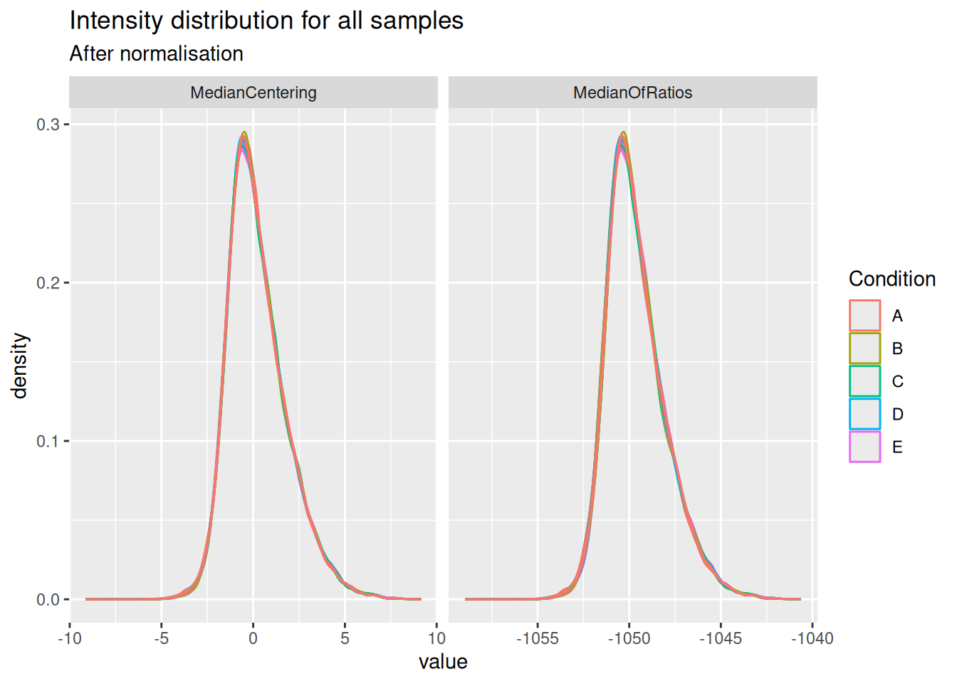
Both the median centering and median or ratio normalisation achieve similar alignment of the intensity distributions. Although they appear visually similar, we will see later that they can lead to different results in statistical inference.
Notice that the QFeatures object contains two diverging assays, one for each normalisation method.
plot(spikein, interactive = TRUE)5.3.2 Explore summarisation methods
With the data normalised, the next step is to summarise ion-level intensities to obtain protein-level expression values. In this chapter, we will compare three summarisation methods:
Robust summarisation (Sticker et al. 2020), as we described in a previous chapter.
Median summarisation, which calculates the median of the log-transformed intensities of all peptides belonging to a protein for each sample separately. While robust to outliers, it can be heavily influenced by inconsistent peptide identification across samples.
Median polish summarisation, is a simple and robust procedure proposed by the statistician John Tukey to fit an additive model for data in a two-way layout table (usually, results from a factorial experiment) of the form row effect + column effect + overall median. Median polish utilizes the medians obtained from the rows and the columns of a two-way table to iteratively calculate the row effect and column effect on the data. The results are robust to outliers, as the iterative procedure uses the medians rather than the means. Here, the row effects are the feature effects and the column effects are the sample/run effects. Particularly, following model is considered: $ y_{ip} = p^ + i^ + {ip}\(, where\)y{ip}$ is the log-normalised feature intensity (precursor, PSM or peptide) belonging to protein \(P\) in sample \(i\). \(\beta_p^\text{pep}\) is the average effect of feature \(p\), which account for the fact that different features yield different baseline intensities. \(\beta_i^\text{samp}\) is the average effect of sample \(i\). In other words, it provides the estimated log2-transformed and normalised intensity of protein \(P\) in sample \(i\) corrected for the feature effect, which will be used as the summarised protein value. \(\epsilon_{ip}\) is the residual effect that cannot be explained by the average sample and precursor effects.
maxLFQ summarisation, maxLFQ summarise the precursor-level data into protein intensities. It first calculates all pairwise log ratio’s between samples only using their shared precursors. Particularly, it uses the median of the log ratio’s between the shared precursors s, i.e. \[r_{ij} = median(y_{sj}-y_{si})\]. Hence, it first eliminates peptide effects. It then estimates the summaries by solving \(\sum_i\sum_j(y^{prot}_j - y^{prot}_i - r_ij)^2\) and
The robust, median and median polish summarisation methods are available in MsCoreUtils and maxLFQ is implemented in the maxLFQ function of the iq package. All methods can be integrated with QFeatures.
summMethods <- c(
  robustSummary = MsCoreUtils::robustSummary,
  colMedians = colMedians,
  medianPolish = MsCoreUtils::medianPolish,
  maxLFQ = function(X, ...) iq::maxLFQ(X)$estimate
)
We will therefore create a loop that iterates over the normalised data sets and over the summarisation methods.
for (i in c("ions_norm_MedianOfRatios", "ions_norm_MedianCentering")) {
  for (j in names(summMethods)) {
    newSet <- paste0("proteins_", sub("ions_norm_", "", i), "_", j)
    spikein <- aggregateFeatures(
      spikein, i = i,
      name = newSet,
      fcol = "Proteins",
      fun = summMethods[[j]],
      na.rm = TRUE
    )
  }
}
Your quantitative and row data contain missing values. Please read the
relevant section(s) in the aggregateFeatures manual page regarding the
effects of missing values on data aggregation.
Aggregated: 1/1Your quantitative and row data contain missing values. Please read the
relevant section(s) in the aggregateFeatures manual page regarding the
effects of missing values on data aggregation.
Aggregated: 1/1Your quantitative and row data contain missing values. Please read the
relevant section(s) in the aggregateFeatures manual page regarding the
effects of missing values on data aggregation.
Aggregated: 1/1Your quantitative and row data contain missing values. Please read the
relevant section(s) in the aggregateFeatures manual page regarding the
effects of missing values on data aggregation.
Aggregated: 1/1Your quantitative and row data contain missing values. Please read the
relevant section(s) in the aggregateFeatures manual page regarding the
effects of missing values on data aggregation.
Aggregated: 1/1Your quantitative and row data contain missing values. Please read the
relevant section(s) in the aggregateFeatures manual page regarding the
effects of missing values on data aggregation.
Aggregated: 1/1Your quantitative and row data contain missing values. Please read the
relevant section(s) in the aggregateFeatures manual page regarding the
effects of missing values on data aggregation.
Aggregated: 1/1Your quantitative and row data contain missing values. Please read the
relevant section(s) in the aggregateFeatures manual page regarding the
effects of missing values on data aggregation.
Aggregated: 1/1The data processing is now complete. The QFeatures object now contains a workflow of assays, from input PSMs to normalised and summarised proteins. The data set contains 2 sets obtained using 2 normalisation methods, and each normalised set has been summarised with four different methods.
plot(spikein, interactive = TRUE)5.4 Data modelling
The preprocessed data for all 6 workflows1 can now be modelled to assess our research hypothesis using the same approach, as described in the basics chapter2. Remember, the central research question is to “prioritise proteins that have been spiked in across the conditions.” Since we know the ground truth, we can assess how accurately the model estimates the fold changes between spike-in conditions, and hence which preprocessing workflow leads to the best results.
We loop over the different assays to fit the model for the different preprocessed sets3. Recall that the model estimation results are stored in the rowData of each set.
proteinSets <- grep("proteins_", names(spikein), value = TRUE)
for (i in proteinSets) {
  spikein <- msqrob(
    spikein,  i = i, formula = ~ Condition,
    ridge = TRUE,
    robust = TRUE,
    overwrite = TRUE
  )
}
We enable M-estimation (robust = TRUE) for improved robustness against outliers and ridge regression (ridge = TRUE) to stabilise parameter estimates4.
We can create our contrasts of interest and perform hypothesis testing.
allContrasts <- createPairwiseContrasts(
    ~ Condition, colData(spikein), var = "Condition" , ridge = TRUE
)
L <- makeContrast(
    allContrasts,
    c("ridgeConditionB", "ridgeConditionC", "ridgeConditionD", "ridgeConditionE")
    )

inferences <- lapply(proteinSets, function(i) {
  spikein <- hypothesisTest(spikein, i, contrast = L)
  inference <- msqrobCollect(spikein[[i]], L)
  inference$method <- i
  inference
})
inferences <- do.call(rbind, inferences)
We also add the information whether a protein is differentially abundant or not, since all E. coli proteins are known to be spiked in different concentrations.
inferences <- mutate(
  inferences,
  isEcoli = feature %in% ecoli,
  normalisation = sub("(.*)_(.*)_(.*)", "\\2", method),
  summarisation = sub("(.*)_(.*)_(.*)", "\\3", method),
  contrast = gsub("ridgeCondition", "", contrast),
  contrast = gsub("^([B-E])$", "\\1 - A", contrast),
)
5.5 Performance Evaluation
Since we have ground truth information (i.e., we know which proteins are from E. coli and should be differentially abundant), we can objectively evaluate the performance of each workflow. Similarly to the previous chapter, we will assess the number of true positives (TP, that are correctly identified E. coli proteins) and false positives (FP, that are human proteins incorrectly identified as significant), the false discovery proportion (FDP), the accuracy of the estimated log2 fold changes (LFC), and finally, the overall performance using True Positive Rate (TPR) versus False Discovery Proportion (FDP) curves.
Before delving into the performance plot, we will first create a colour scheme in order to compare the different workflows. We will assign a colour to each combination of normalisation and summarisation method. We also remove the prefix “ridgeCondition” in the contrasts.
inferences <- inferences |>
  mutate(
  workflow = paste0(normalisation, "_", summarisation),
  contrast = gsub(pattern = "ridgeCondition", "", contrast)
)
colours <- c(
  MedianCentering_colMedians = "#fcba03",
  MedianCentering_maxLFQ ="#c29310",
  MedianCentering_medianPolish = "#7a5a0a",
  MedianCentering_robustSummary = "#423512",
  MedianOfRatios_colMedians = "#5bb4fc",
  MedianOfRatios_maxLFQ = "#0b69b5",
  MedianOfRatios_medianPolish = "#084a85",
  MedianOfRatios_robustSummary = "#0f2a40"
)
5.5.1 TP and FP at 5% FDR
We will first construct the table with TPs and FPs obtained from each data modelling approach for each comparison.
tpFpTable <- inferences |>
  na.omit() |>
  mutate(TP = adjPval < 0.05 & isEcoli,
         FP = adjPval < 0.05 & !isEcoli) |>
  group_by(normalisation, workflow, contrast) |>
  summarise("TruePositives" = sum(TP),
            "FalsePositives" = sum(FP)) |>
  mutate(FDP = FalsePositives / (TruePositives + FalsePositives)) |>
      pivot_longer(cols = c("TruePositives", "FalsePositives"),
                   names_to = "metric", values_to = "count")
`summarise()` has regrouped the output.
ℹ Summaries were computed grouped by normalisation, workflow, and contrast.
ℹ Output is grouped by normalisation and workflow.
ℹ Use `summarise(.groups = "drop_last")` to silence this message.
ℹ Use `summarise(.by = c(normalisation, workflow, contrast))` for per-operation
grouping (`?dplyr::dplyr_by`) instead.We then plot the table as a bar plot, facetting for every comparison.
ggplot(tpFpTable) +
  aes(
    x = normalisation, y = count,
    fill = workflow
  ) +
  geom_bar(
    stat = "identity", position = position_dodge(preserve = "single"),
    color = "black"
  ) +
  facet_grid(contrast ~ metric, scales = "free") +
  scale_fill_manual(values = colours) +
  theme(axis.text.x = element_text(angle = 90, hjust = 1))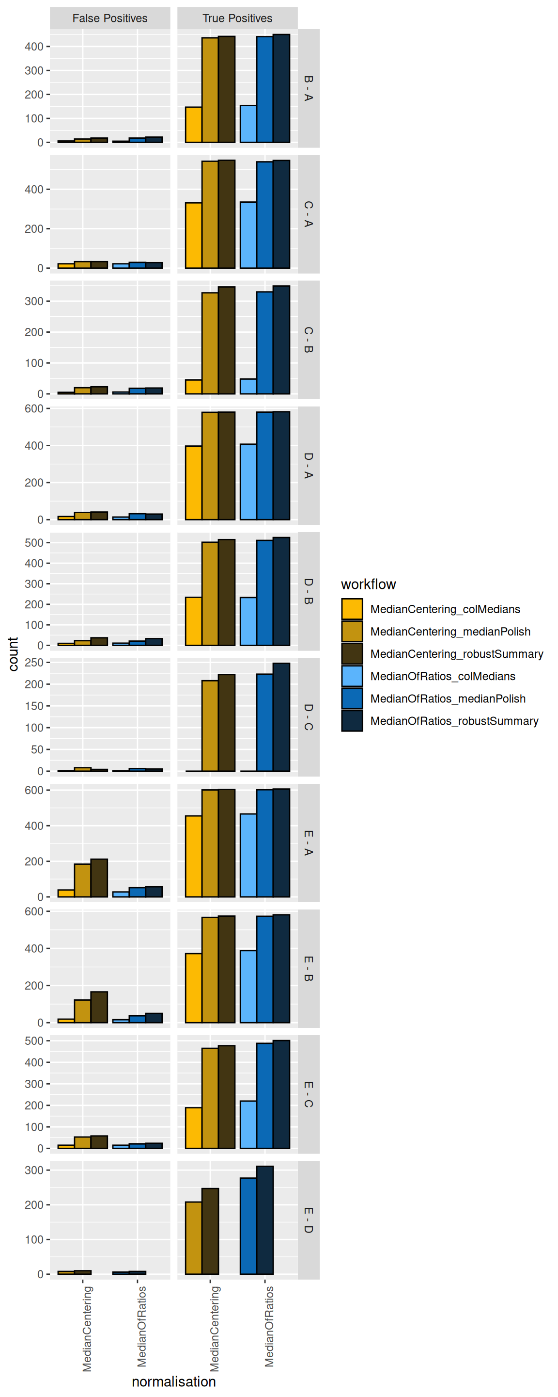
We see that, while it has minimal impact on the TPs, the median centering normalisation approach increases the number of FPs for some comparisons (E-A and E-B). We therefore suggest to use the Median of Ratios normalisation method.
More importantly, we see that summarising using the column median leads to poor performance (irrespective of the normalisation method used) as these workflow identify less TPs. This can be easily explained: the summarisation step in this workflow does not account for the fact that different PSMs are often observed for a protein in the different samples and that their corresponding intensities largely fluctuate according to the differences in the PSM characteristics. The median polish, maxLFQ and the robust summary summarisation methods show similar performance for most comparisons.
maxLFQ from the iq package has a slightly higher sensitivity for some comparisons and slightly more false positives in others. Note, however, that median polish is computationally much less demanding and is recommended for designs with many samples.
5.5.2 TPR-FDP curves
We generate the TPR-FDP curves to assess the performance of the different workflows to prioritise differentially abundant proteins. Again, these curves are built using the ground truth information about which proteins are differentially abundant (spiked in) and which proteins are constant across samples. We create two functions to compute the TPR and the FDP.
computeFDP <- function(pval, tp) {
    ord <- order(pval)
    fdp <- cumsum(!tp[ord]) / 1:length(tp)
    fdp[order(ord)]
}
computeTPR <- function(pval, tp, nTP = NULL) {
    if (is.null(nTP)) nTP <- sum(tp)
    ord <- order(pval)
    tpr <- cumsum(tp[ord]) / nTP
    tpr[order(ord)]
}
We apply these functions and compute the corresponding metric using the statistical inference results and the ground truth information.
We also highlight the observed FDP at a 5% FDR threshold.
workPoints <- group_by(performance, summarisation, normalisation, contrast) |>
    filter(adjPval < 0.05) |>
    slice_max(adjPval)
We can now generate the plot5.
ggplot(performance) +
    aes(
        y = fdp,
        x = tpr,
        colour = workflow
    ) +
    geom_line() +
    geom_point(data = workPoints, size = 3) +
    geom_hline(yintercept = 0.05, linetype = 2) +
    facet_grid(contrast ~ .) +
    coord_flip(ylim = c(0, 0.2)) +
    scale_colour_manual(values = colours)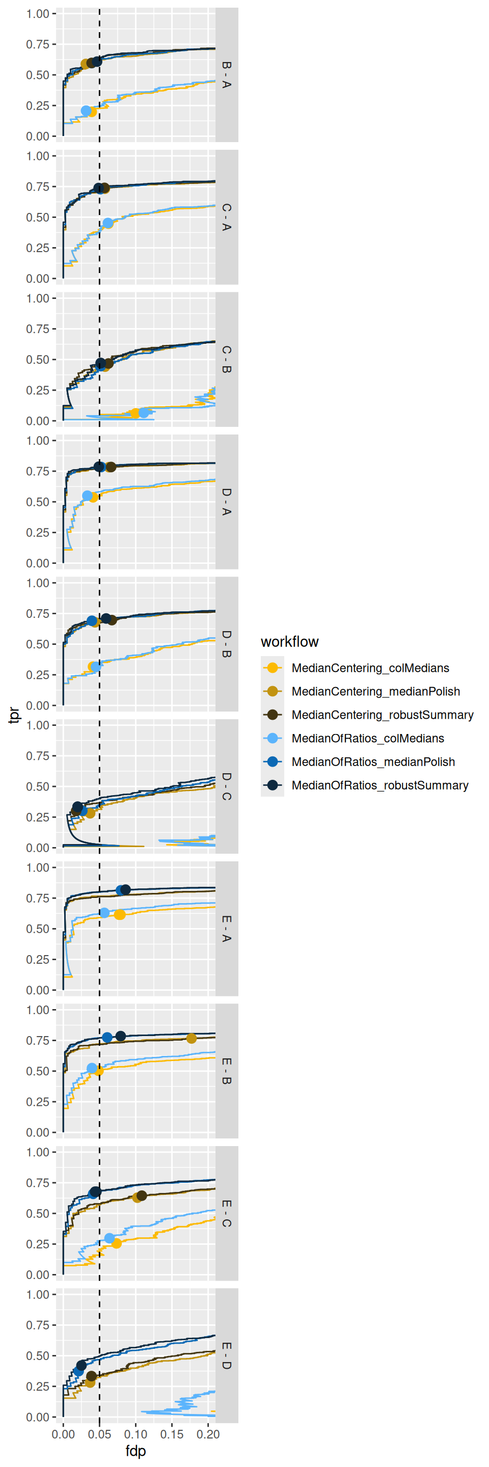
Again, TPR-FDP curves clearly indicate a suboptimal performance (lower sensitivity at the same false discovery proportion) of median summarisation.
We also observe a benefit of the Median Of Ratios normalisation, which seems to improve the FDR control accross the board6 as well as the sensitivity in contrasts involving the higher spike-in conditions.
This can be explained by the difference in composition between the samples that is inherent to spike-in design. Indeed, median normalisation only accounts for differences in loading by considering within sample information only, whereas Median of Ratios normalisation uses both within and between sample information.
5.5.3 Fold change boxplots
Finally, we estimate the accuracy and precision of the log2-fold changes using boxplots. We first create a table with the ground truth information from the spike-in experiment.
realLogFC <- data.frame(
  expectedLogFC = t(L) %*% lm(log2(Concentration) ~ Condition, colData(spikein))$coef[-1]
)
realLogFC$contrast <- gsub("ridgeCondition","",colnames(L))
realLogFC$contrast <- gsub("^([B-E])$", "\\1 - A", realLogFC$contrast)
We now plot the estimated log2-fold changes, focusing on the differentially abundant proteins (E. Coli proteins). The dashed line represents the true log2-fold change for each comparison.
filter(inferences, isEcoli) |>
  ggplot() +
  aes(
      y = logFC,
      x = normalisation,
      colour = workflow
  ) +
  geom_boxplot()  +
  facet_grid(contrast ~ ., scales = "free") +
  geom_hline(data = realLogFC, aes(yintercept = expectedLogFC),
             linetype = "dashed") +
  scale_colour_manual(values = colours) +
  theme(axis.text.x = element_text(angle = 90, hjust = 1))
Warning: Removed 7512 rows containing non-finite outside the scale range
(`stat_boxplot()`).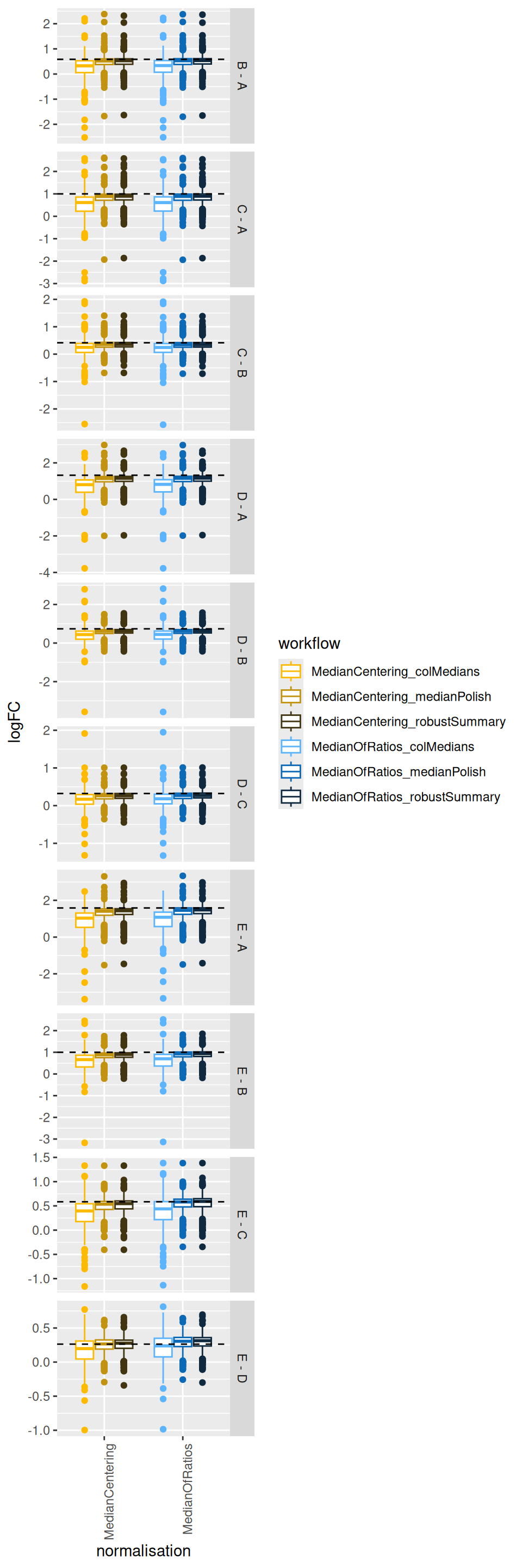
The plots show that median summarisation produces biased fold change estimates, again because it does not account for the differences in the characteristics of the PSMs that are observed in the different samples.
5.6 Conclusion
In this chapter, we objectively compared different normalisation and summarisation strategies using a spike-in dataset with known ground truth.
Normalisation is critical: The performance evaluation clearly shows that the choice of normalisation method has a significant impact on the results. Workflows using the Median of Ratios normalisation consistently outperformed those using simple median centering. They yielded more true positives, better control of the false discovery proportion, and more accurate log2-fold change estimates, particularly for smaller fold changes. This because it not only accounts for differences in loading between samples but also for differences in the compositionality.
Column median summarisation is suboptimal: we found that summarising peptide data to protein intensities using the column (sample) median leads to reduced sensitivity (low True Positive Rate) and specificity (low False Discovery Proportion), but also to lower accuracy (i.e. the estimated log2-fold changes are further from the true value on average) and precision (the estimations are more spread around the average estimation).
MaxLFQ, median polish and robust summary provide comparable performance: the TPR-FDP curves show that the pipelines incorporating robust summarisation and median polish are consistently closer to the ideal top-left corner, with only subtle differences between the two approaches. This indicates that explicitly modelling peptide-specific effects and down-weighting outliers leads to more reliable protein-level quantification and inference. Note, that median polish summarisation is computationally less demanding and that we could not find a benefit in performance for robust summarisation that justifies its additional computational overhead.
Based on this comprehensive evaluation, the recommended pipeline for this type of dataset is the Median of Ratios normalisation followed by median polish summarisation. This combination provided the best performance in terms of computational complexity, accuracy, sensitivity and FDR control, demonstrating the strength of msqrob2 in identifying truly differentially abundant proteins while controlling for false discoveries.
Note, that these considerations are based on this specific spike-in study and that this can slightly changes for other datasets.
However, we have seen over a wide range of examples that
- median summarisation generally performs poorly,
- median normalisation performs quite well in datasets with samples that have similar complexity.
- in our hands, median normalisation never seems to drastically outperforms Median of Ratios normalisation, which seems a safe option across the board.
- ridge regression (
ridge = TRUE) works well for designs with one factor with multiple conditions. For this particular study, it provide much better FDR control. However, it increases the computational complexity considerably. For more complex designs with multiple factors ridge regression might be suboptimal because the optimal penalty might differ between factors (and blocking variables) so by defaultridge = FALSEin the msqrob function.
There are 2 normalisaion methods * 3 summarisation methods.↩︎
Note that while we changed the preprocessing workflow, the sources of variation and the model to estimate remain the same as in Chapter 1.↩︎
Those sets that start with
proteins_.↩︎In our hands ridge regression works well for designs with one factor with multiple conditions. However, it increases the computational complexity considerably. For more complex designs with multiple factors ridge regression might be suboptimal because the optimal penalty might differ between factors (and blocking variables) so by default
ridge = FALSEin the msqrob function↩︎Note that the code to build the TPR-FDP curves is identical to the workflow in the previous chapter on data benchmarking.↩︎
the dots indicating the sensitivity and FDP when using a 5% FDR cut-off are much closer to the empirical 5% FDP↩︎