Preliminary: working with tidyverse
Lieven Clement and Jeroen Gilis
statOmics, Ghent University (https://statomics.github.io)
In this tutorial, we will learn how to import, tidy, wrangle and visualize data. All steps will be demonstrated for one example dataset. This tutorial is strongly based on material from the opencasestudies initiative, see link.
1 NHANES dataset
The National Health and Nutrition Examination Survey (NHANES) contains data that has been collected since 1960. For this tutorial, we will make use of the data that were collected between 2009 and 2012, for 10.000 U.S. civilians. The dataset contains a large number of physical, demographic, nutritional and life-style-related parameters.
However, before we can actually start working with data, we will need to learn how to import the required datasets into our Rstudio environment.
2 Data Import
2.1 Introduction to “Tidy data”
The tidyverse is “an opinionated collection of R packages designed for data science. All packages share an underlying philosophy and common APIs.”
Another way of putting it is that it’s a set of packages that are useful specifically for data manipulation, exploration and visualization with a common philosophy.
The common philosophy is called “tidy” data. It is a standard way of mapping the meaning of a dataset to its structure.
In tidy data:
- Each variable forms a column.
- Each observation forms a row.
- Each type of observational unit forms a table.

Below, we are interested in transforming the table on the right to the the table on the left, which is considered “tidy”.

Working with tidy data is useful because it creates a structured way of organizing data values within a data set. This makes the data analysis process more efficient and simplifies the development of data analysis tools that work together. In this way, you can focus on the problem you are investigating, rather than the uninteresting logistics of data.
2.1.1 The tidyverse R package
We can install and load the set of R packages using install.packages("tidyverse") function.
When we load the tidyverse package using library(tidyverse), there are six core R packages that load:
- readr, for data import.
- tidyr, for data tidying.
- dplyr, for data wrangling.
- ggplot2, for data visualisation.
- purrr, for functional programming.
- tibble, for tibbles, a modern re-imagining of data frames.
Here, we load in the tidyverse.
library(tidyverse)These packages are highlighted in bold here:
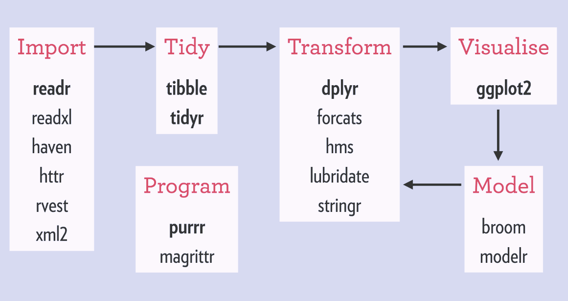
Because these packages all share the “tidy” philosophy, the data analysis workflow is easier as you move from package to package.
Here, we will focus on the readr, dplyr and ggplot2 R packages to import data, to wrangle data and to visualize the data, respectively.
Next, we will give a brief description of the features in each of these packages.
There are several base R functions that allow you read in data into R, which you may be familiar with such as read.table(), read.csv(), and read.delim(). Instead of using these, we will use the functions in the readr R package. The main reasons for this are
Compared to equivalent base R functions, the functions in
readrare around 10x faster.You can specify the column types (e.g character, integer, double, logical, date, time, etc)
All parsing problems are recorded in a data frame.
2.1.2 The readr R package
library(readr)The main functions in readr are:
readr functions |
Description |
|---|---|
read_delim() |
reads in a flat file data with a given character to separate fields |
read_csv() |
reads in a CSV file |
read_tsv() |
reads in a file with values separated by tabs |
read_lines() |
reads only a certain number of lines from the file |
read_file() |
reads a complete file into a string |
write_csv() |
writes data frame to CSV |
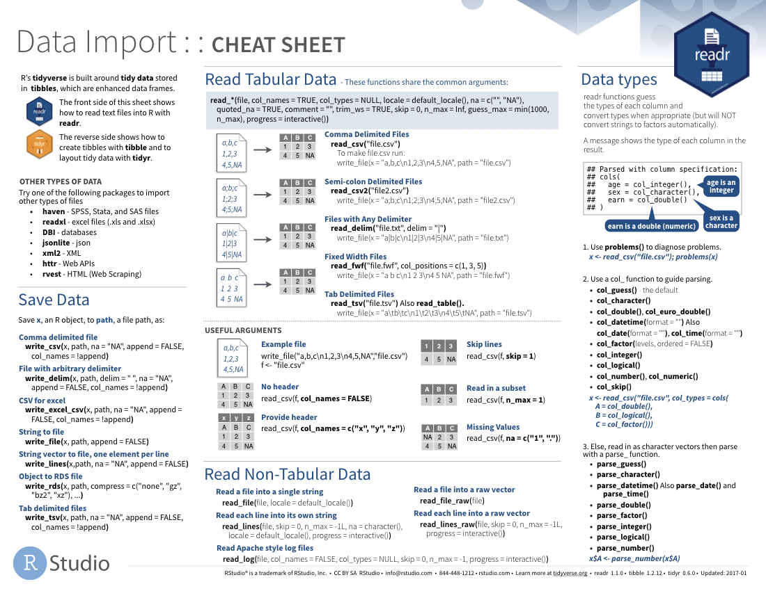
A useful cheatsheet for the functions in the readr package can be found on RStudio’s website:
2.2 Read in data
Let’s try reading in some data. We will begin by reading in the NHANES.csv dataset.
NHANES <- read_csv("https://raw.githubusercontent.com/statOmics/PSLSData/main/NHANES.csv")## Rows: 10000 Columns: 76
## ── Column specification ──────────────────────────────────────────────
## Delimiter: ","
## chr (31): SurveyYr, Gender, AgeDecade, Race1, Race3, Education, Ma...
## dbl (45): ID, Age, AgeMonths, HHIncomeMid, Poverty, HomeRooms, Wei...
##
## ℹ Use `spec()` to retrieve the full column specification for this data.
## ℹ Specify the column types or set `show_col_types = FALSE` to quiet this message.head(NHANES)tail(NHANES)# knitr::kable(NHANES[c(1,4,5,6,7,8),c(1,3,4,7,17,20,21,25)],format = "markdown")
NHANES[c(1, 4, 5, 6, 7, 8), c(
"ID",
"Gender",
"Age",
"Race1",
"Weight",
"Height",
"BMI",
"BPSysAve"
)] # display a select set of variable and subjects2.3 Take a glimpse() at your data
One last thing in this section. One way to look at our data would be to use head() or tail(), as we just saw. Another one you might have heard of is the str() function. One you might not have heard of is the glimpse() function. It’s used for a special type of object in R called a tibble. Let’s read the help file to learn more.
?tibble::tibbleIt’s kind of like print() where it shows you columns running down the page. Let’s try it out.
glimpse(NHANES[, 1:10])## Rows: 10,000
## Columns: 10
## $ ID <dbl> 51624, 51624, 51624, 51625, 51630, 51638, 5164…
## $ SurveyYr <chr> "2009_10", "2009_10", "2009_10", "2009_10", "2…
## $ Gender <chr> "male", "male", "male", "male", "female", "mal…
## $ Age <dbl> 34, 34, 34, 4, 49, 9, 8, 45, 45, 45, 66, 58, 5…
## $ AgeDecade <chr> "30-39", "30-39", "30-39", "0-9", "40-49", "0-…
## $ AgeMonths <dbl> 409, 409, 409, 49, 596, 115, 101, 541, 541, 54…
## $ Race1 <chr> "White", "White", "White", "Other", "White", "…
## $ Race3 <chr> NA, NA, NA, NA, NA, NA, NA, NA, NA, NA, NA, NA…
## $ Education <chr> "High School", "High School", "High School", N…
## $ MaritalStatus <chr> "Married", "Married", "Married", NA, "LivePart…# or glimpse(NHANES) to see all the variables in the dataset3 Data Wrangling
A subset of the data analysis process can be thought about in the following way:
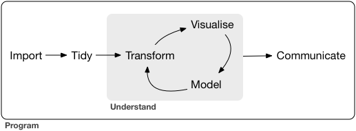
where each of these steps needs its own tools and software to complete.
After we import the data into R, if we are going to take advantage of the “tidyverse”, this means we need to transform the data into a form that is “tidy”. If you recall, in tidy data:
- Each variable forms a column.
- Each observation forms a row.
- Each type of observational unit forms a table.
For example, consider the following dataset:

Here:
- each row represents one company (row names are companies)
- each column represent one time point
- the stock prices are defined for each row/column pair
Alternatively, a data set can be structured in the following way:
- each row represents one time point (but no row names)
- the first column defines the time variable and the last three columns contain the stock prices for three companies

In both cases, the data is the same, but the structure is different. This can be frustrating to deal with as an analyst because the meaning of the values (rows and columns) in the two data sets are different. Providing a standardized way of organizing values within a data set would alleviate a major portion of this frustration.
For motivation, a tidy version of the stock data we looked at above looks like this: (we’ll learn how the functions work in just a moment)

In this “tidy” data set, we have three columns representing three variables (time, company name and stock price). Every row represents contains one stock price from a particular time and for a specific company.
If we consider our NHANES dataframe, we see it is already in a tidy format, as;
- Each variable forms a column.
- Each observation forms a row.
- Each type of observational unit forms a table.
Each row contains all of the information on a single subject (US civilian) in the study.
After we finished with the manipulation and visualization of the NHANES dataset, we will additional work with a dataset on the effects of a certain drug, captopril, on the systolic and diastolic blood pressure of patients. This will not be a tidy dataset. Therefore, the details of tidying data with tidyverse will be described below.
3.1 The dplyr R package
3.1.1 What is the dplyr R package ?
dplyr is a powerful R-package to transform and summarize tabular data with rows and columns.
The package contains a set of functions (or “verbs”) to perform common data manipulation operations such as filtering for rows, selecting specific columns, re-ordering rows, adding new columns and summarizing data.
In addition, dplyr contains a useful function to perform another common task which is the is the “split-apply-combine” concept. We will discuss that in a little bit.
3.1.2 Compare dplyr R package compare with base functions R
If you are familiar with R, you are probably familiar with base R functions such as split(), subset(), apply(), sapply(), lapply(), tapply() and aggregate(). Compared to base functions in R, the functions in dplyr are easier to work with, are more consistent in the syntax and are targeted for data analysis around data frames instead of just vectors.
The important dplyr verbs to remember are:
dplyr verbs |
Description |
|---|---|
select() |
select columns |
filter() |
filter rows |
arrange() |
re-order or arrange rows |
mutate() |
create new columns |
summarize() |
summarize values |
group_by() |
allows for group operations in the “split-apply-combine” concept |
3.1.3 Pipe operator: %>%
Before we go any further, let’s introduce the pipe operator: %>%. In the stocks example, we briefly saw this symbol. It is called the pipe operator. dplyr imports this operator from another package (magrittr) see help file here. This operator allows you to pipe the output from one function to the input of another function. Instead of nesting functions (reading from the inside to the outside), the idea of of piping is to read the functions from left to right.
In the online stocks example, we can pipe the stocks data frame to the function that will gather multiple columns into key-value pairs.

3.1.4 combining and splittin columns with unite() and separate()
First, let’s unite the ID and SurveyYr columns in the NHANES dataset to a single column united.
To do this, we will use the unite() function in the tidyr package.
Note that:
unite()= unite multiple columns into oneseparate()= separate one column into multiple columns
library(tidyverse)
NHANES <- NHANES %>%
unite(United,
ID:SurveyYr,
sep = "-"
)
head(NHANES)Let us walk through the snippet of code from above. First, we need to specify the name of the dataset that we want to work with. Next, we use the pipe command to pipe the output from the first function (here this is simply taking the NHANES dataset) to the input of another function (in this case, the unite function). Finally, we apply the unite function. In this example, the unite function takes three arguments 1. The name of the new column, as a string or symbol 2. A selection of colums we want to unite 3. The separator to use between values
The behaviour of the unite function is as expected; the initial variables ID and SurveyYr are now united into a new variable united.
The separate() function performs the exact opposite operation of the unite() function, as shown below;
NHANES <- NHANES %>%
separate(United,
sep = "-",
into = c("ID", "SurveyYear")
)
head(NHANES)3.1.5 Select columns using select()
The two most basic functions are select() and filter() which selects columns and filters rows, respectively.
To select a range of columns by name, use the “:” (colon) operator
NHANES %>%
select(Gender:Age)To select all columns that start with the character string “t”, use the function starts_with()
NHANES %>%
select(starts_with("t"))Some additional options to select columns based on a specific criteria include
ends_with()= Select columns that end with a character stringcontains()= Select columns that contain a character stringmatches()= Select columns that match a regular expressionone_of()= Select columns names that are from a group of names
3.1.6 Select rows using filter()
Let’s say we want to investigate weight of
men that
are older than 18 years old, and
that are taller than 120 cm
NHANES %>%
select(c("Gender", "Age", "Weight", "Height")) %>% ## select four colums
filter(
Gender == "male",
Age > 18,
Height > 120
) ## filter observations (rows) based on the required values3.1.7 Arrange or re-order rows using arrange()
Now, let’s say we want to see the NHANES data ordered from lowest to highest Age. To arrange (or re-order) rows by a particular column you’ll use the arrange() function:
NHANES %>%
arrange(Age)With this suite of tidyr fucntions, in combination with base R logical expression, we can easily select all of the required data to assess specific, detailed research questions.
(*) Example; Within the Race1 category of Hispanics, select women that are not married and display the first five by descending height.
Hint: use the desc() function inside of arrange() to order rows in a descending order.
NHANES %>%
select(c("Race1", "Gender", "MaritalStatus", "Height")) %>%
filter(MaritalStatus != "Married", Race1 == "Hispanic", Gender == "female") %>%
arrange(desc(Height)) %>%
head(n = 5)3.1.8 Add columns using mutate()
Let’s say we don’t trust the BMI values in our dataset and we decide to calculate them ourselves. BMI is typically calculated by taking a person’s weigth (in kg) and dividing it by the its height (in m) squared.
We will now construct a new column, BMI_self, by adopting this formula. To create new columns, we will use the mutate() function in dplyr.
NHANES %>%
select(c("Weight", "Height", "BMI")) %>%
mutate(BMI_self = Weight / (Height / 100)**2)3.1.9 Create summaries of columns using summarise()
The summarise() function in dplyr will create summary statistics for a given column in the data frame, such as finding the maximum, minimum or average.
For example, to compute the average weigth of the civilians, we can apply the mean() function to the column Weight and call the summary value avg_Weight.
NHANES %>%
summarise(avg_Weight = mean(Weight, na.rm = TRUE))## the addition argument na.rm = TRUE makes sure to remove missing
## values for the purpose of calculating the meanThere are many other summary statistics you could consider such sd(), min(), median(), max(), sum(), n() (returns the length of vector), first() (returns first value in vector), last() (returns last value in vector) and n_distinct() (number of distinct values in vector). We will elaborate on these functions later.
Note that choosing the most informative summary statistic is very important! This can be shown with the following example;
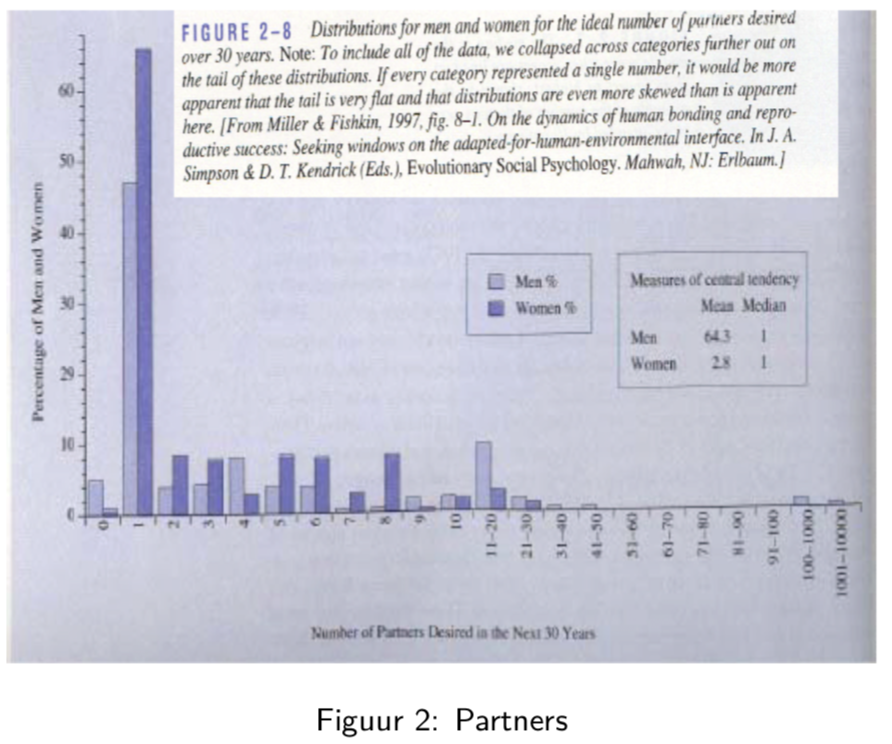
In this sudy, men and woman were asked about their “ideal number of partners desired over 30 years”. While almost all subjects desired a number betweeb 0 and 50, three male subjects selected a number above 100. These three outliers in the data can have a large impact on the data analysis, especially when we work with summary statistics that are sensitive to these outliers.
When we look at the mean, for instance, we see that on average woman desire 2.8 partners, while men desire 64.3 partners on average, suggesting a large discrepancy between male and female desires.
However, if look at a more robust summary statistic such as the median, we see that the result is 1 for both men and woman. It is clear that the mean value was completely distorted by the three outliers in the data.
Another example of a more robust summary statistic is the geometric mean.
3.1.10 Group operations using group_by()
The group_by() verb is and incredibly powerful function in dplyr. It allows us, for example, to calculate summary statistics for different groups of observations.
If we take our example from above, let’s say we want to split the data frame by some variable (e.g. Race1), apply a function to the individual data frames (mean) and then combine the output back into a summary data frame.
Let’s see how that would look
NHANES %>%
group_by(Race1) %>%
summarise(avg_Weight = mean(Weight, na.rm = TRUE))Now that we have all the required functions for importing, tidying and wrangling data in place, we will learn how to visualize our data with the ggplot2 package.
4 Data Visualization
As you might have have already seen, there are many functions available in base R that can create plots (e.g. plot(), boxplot()). Others include: hist(), qqplot(), etc. These functions are great because they come with a basic installation of R and can be quite powerful when you need a quick visualization of something when you are exploring data.
We are choosing to introduce ggplot2 because, in our opinion, it’s one of the simplest ways for beginners to create relatively complicated plots that are intuitive and aesthetically pleasing.
4.1 The ggplot2 R package
The reasons ggplot2 is generally intuitive for beginners is the use of grammar of graphics or the gg in ggplot2. The idea is that you can construct many sentences by learning just a few nouns, adjectives, and verbs. There are specific “words” that we will need to learn and once we do, you will be able to create (or “write”) hundreds of different plots.
The critical part to making graphics using ggplot2 is the data needs to be in a tidy format. Given that we have just spend the last two lectures learning about how to work with tidy data, we are primed to take advantage of all that ggplot2 has to offer!
We will show how it’s easy to pipe tidy data (output) as input to other functions that creates plots. This all works because we are working within the tidyverse.
4.2 ggplot2 cheatsheet
The ggplot2 cheat sheet is a very handy list for looking up ggplot2 functions, see cheatsheet
4.3 What is the ggplot() function?
As explained by Hadley Wickham:
the grammar tells us that a statistical graphic is a mapping from data to aesthetic attributes (colour, shape, size) of geometric objects (points, lines, bars). The plot may also contain statistical transformations of the data and is drawn on a specific coordinates system. ####
ggplot2Terminology * ggplot - the main function where you specify the data set and variables to plot (this is where we define thexandyvariable names) * geoms - geometric objects * e.g.geom_point(),geom_bar(),geom_line(),geom_histogram()* aes - aesthetics * shape, transparency, color, fill, linetype * scales - define how your data will be plotted * continuous, discrete, log, etc
There are three ways to initialize a ggplot() object.
An empty ggplot object
library(ggplot2)
p <- ggplot()A ggplot object associated with a dataset
p <- NHANES %>%
filter(Gender == "male") %>%
ggplot()or a ggplot object with a dataset and x and y defined
p <- NHANES %>%
filter(Gender == "male") %>%
ggplot(aes(x = Height, y = Weight))The function aes() is an aesthetic mapping function inside the ggplot() object. We use this function to specify plot attributes (e.g. x and y variable names) that will not change as we add more layers.
pNow we have initialize a ggplot object on a subset of the NHANES dataset. But the plot is still empty! To actually show the data, we will need an additional command, specifying which visualization type we want to use. Importantly, different types of visualizations will provide us with different types of information! This we will discuss in more detail in the following tutorial. For now, we will demonstrate how to generate a scatterplot.
4.4 Create scatter plots using geom_point()
Anything that goes in the ggplot() object becomes a global setting. From there, we use the geom objects to add more layers to the base ggplot() object. These will define what we are interested in illustrating using the data.
For the NHANES dataset, we can for instance look at the relationship between a person’s height and weigth values.
p <- NHANES %>%
filter(Gender == "male", Age >= 18) %>%
ggplot(aes(x = Height, y = Weight)) +
geom_point() +
xlab("Height (cm)") +
ylab("Weight (kg)")
p## Warning: Removed 35 rows containing missing values (geom_point).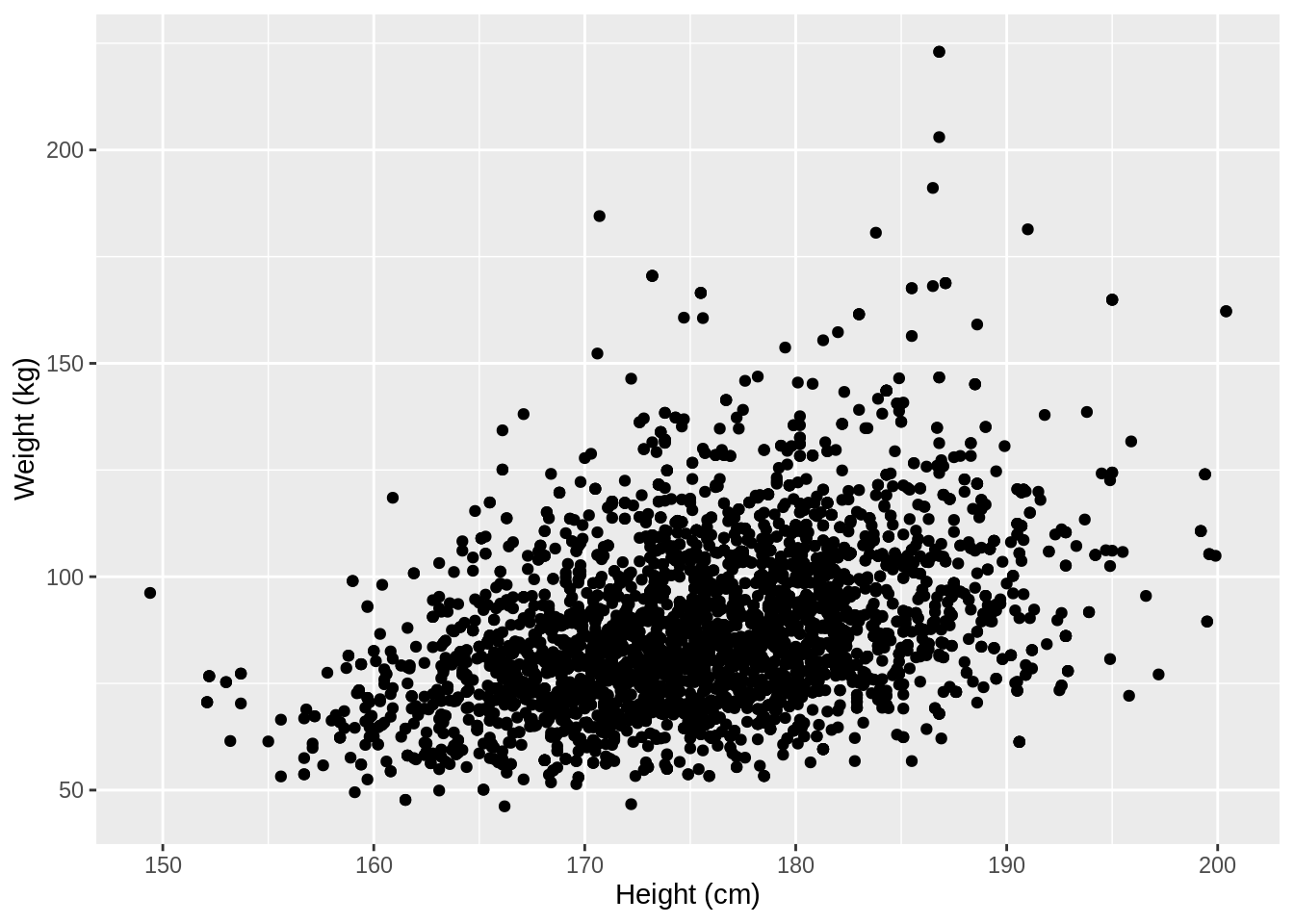
We used the xlab() and ylab() functions in ggplot2 to specify the x-axis and y-axis labels. Note that NA values were automatically remove by the geom_point function.
ggplot2 also has a very broad panel of aesthetic features for improving your plot. One very basic feature is that we can give colors to the ggplot object. For instance, we can give different colors to the dots in the previous scatterplot based on a subject’s gender.
NHANES %>%
ggplot(aes(x = Height, y = Weight, color = Gender)) +
geom_point() +
xlab("Height (cm)") +
ylab("Weight (kg)")## Warning: Removed 366 rows containing missing values (geom_point).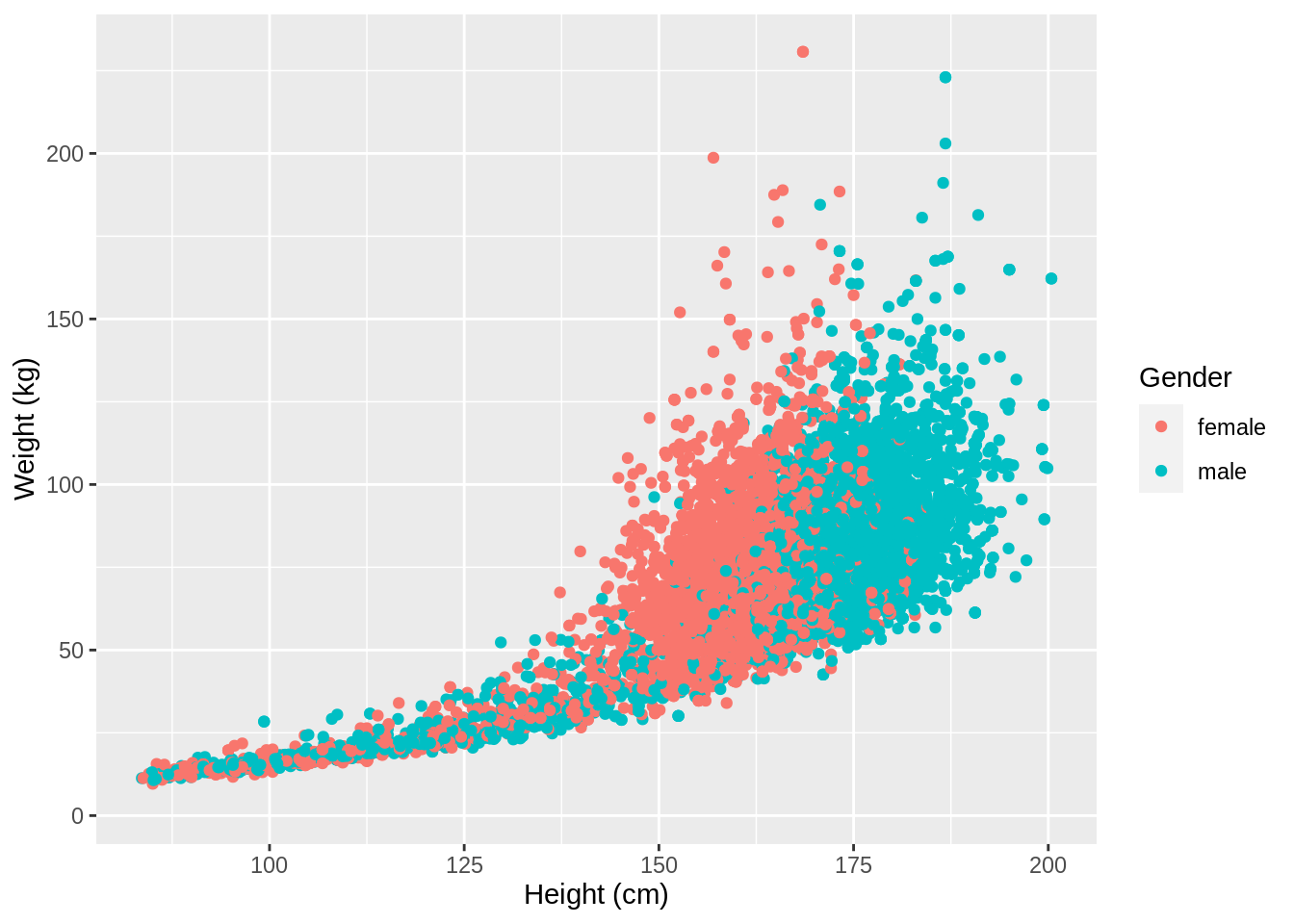
This concludes the preliminary file. To see all of these tidyverse and ggplot functionalities in action, we will explore the NHANES dataset more thoroughly in the first tutorial.